Perhaps you would like to hear the tale? It begins on a dark night, where a dark man waits… with a dark purpose.
-Disney’s Aladdin 1992
What are dark patterns?
The term “dark pattern” has been buzzing around the marketing and web design/development community and beyond lately after some… questionable tactics were used on a fundraising website for a certain ex-president. We won’t go into that specific drama here but look it up if you are interested, it’s a wild ride. What is a dark pattern? Dark patterns describe several tactics used on websites and apps to make you do things that you didn’t mean to do or did not realize you were doing.
The term was coined by Harry Brignul in 2010 and he now operates a website to raise awareness as well as gives expert testimony in lawsuits. Yes, you heard that right, companies HAVE been sued for the use of dark patterns.
It is important to separate designs that utilize dark patterns from bad design practices. Dark patterns are not the result of bad coding, the failure to follow good design principles, or accidents. They are carefully crafted with deep knowledge of design and psychology to get the user to do something this is in the best interest of the company and not the user.
Common types of dark patterns
Confirmshaming
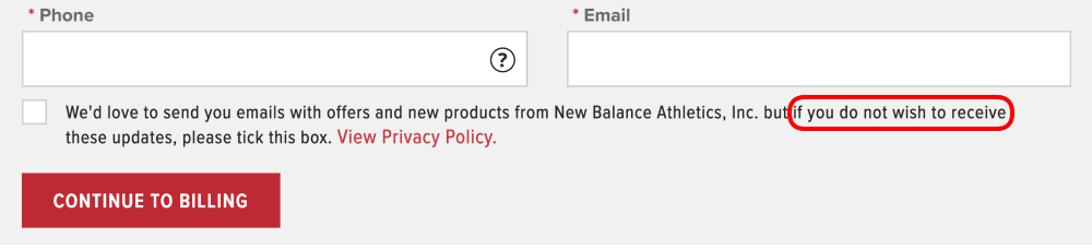
“No thanks, I hate saving money.” Have you ever seen that text replace a simple “no” in a popup offer window? Confirmshaming is a way to guilt or shame a user into opting into or out of something.
Privacy Zuckering
Named for one of its most famous examples, Facebook, privacy zuckering is being deceptive or not transparent about how you collect user data, what data is collected, how it is used, or even that you are collecting data at all. Facebook has faced several lawsuits for this including one with a $650m settlement.
Trick question:
A question or input on a form that does not act the way the user expects or tricks them into giving away information without realizing it. An example would be two consent boxes, if one is checked it means the user does not consent, but if the other is checked it means they do consent. This simple switch as to what a check means can easily make users agree to something they did not intend to.
Roach Motel and Forced Continuity:
It’s easy to get in, you NEVER get out. Have you ever tried to cancel a “free trial” before recurring membership payments start? How easy was it to do? One of the worst examples is how hard Amazon makes it to cancel your account. Do you even know anyone who has ever canceled their Amazon account?
Sneak Into Basket and Hidden Costs:
Somewhere in the checkout process, a product is added to the customer’s purchase without them fully realizing it or an additional expense is only revealed at the last step of the checkout process. An example would be revealing a huge fee for product protection insurance a customer did not even realize was an opt-out of option on the confirmation page after a user has put a lot of time and effort into going through the checkout process.
Bait and Switch
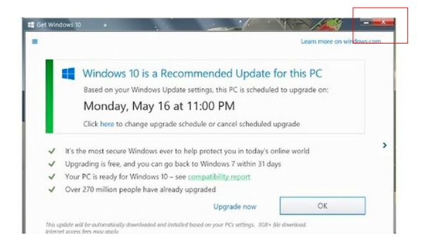
The user intends to do one thing, but a different, undesirable thing happens instead. One of the most egregious examples of this was the tactic Microsoft used to trick stubborn users into upgrading to Windows 10. They began with popups on Window 8 and below suggesting users upgrade to Windows 10. At first, users had the option of clicking the “upgrade now” button, the “ok” button which dismissed the popup, or clicking the X in the top right corner to close the popup. That X had always meant “close” going all the way back to the 1980s, so when Microsoft changed the meaning of that X on that one popup to mean “yes, start the upgrade” users were enraged.
Friend Spam
You ask your users to give you access to their contact or friends lists under the guise of something desirable happening but your company uses the information for other means. The most infamous example of this that ended in a lawsuit was when Linkedin asked new users to give them access to their email contact list claiming it was to help them see who was on the platform and connect. What Linkedin also did with those email addresses was send out unwanted messages to all of your contacts that looked like YOU were inviting them to join Linkedin. This resulted in a class-action lawsuit in 2015 that was resolved with the ability for anyone who signed up for Linkedin between September 2011 and October 2014 to claim $10 in compensation. To date, Linkedin has shelled out $13M.
What are the risks and rewards of using dark patterns?
Many dark pattern tactics have become the common and (begrudgingly) accepted norm for how websites, apps, and digital platforms work. Many UI/UX designers and developers claim that if they don’t do it, someone else will. However, if you find you do use dark patterns you should ask yourself “is it worth it?” Using these tactics can earn you money in the short term, but often cost you in the long term in areas such as customer trust and satisfaction and it opens you up to possible legal peril if your tactics cross the line.
We are starting to see the Sheriff come to town in terms of governments and governing bodies being willing and able to police the internet. The EU General Data Protection Regulation (GDPR), which governs how user data is collected, transferred, and used, went into effect in 2018. And we’ve seen from examples in the list above, many companies have been successfully sued in lower courts despite there not being hard laws on the books about how companys can operate online.
Dark Vs. Light UX Patterns
Dark and Light patterns are not exactly polar opposites. Dark patterns are designed to benefit the business to the detriment of the user while light patterns are designed with the best interests of the user in mind but not necessarily to the detriment of the business. With light pattern UX you may not get that extra revenue from people accidentally adding that product upgrade to their cart, but what you do get is a satisfied customer base with who you can build trust and who have confidence in your business. User experiences built on light patterns are often also inherently more simple, easy to follow, and accessible meaning you may have more conversions.
Conclusion
There are always tactics marketed as ways to give your business an edge or maximize upsells, upgrades, and conversions but always ask yourself if it may fall into a dark pattern. A bit quaint, but the old saying “you catch more flies with honey than vinegar” is pretty apt here.
