It’s a bit ironic that I am writing a top trend post given my habit of largely eschewing trends in my own work. The issue I have with trends is that they are…well, trends. By their nature, they may make your website aesthetically obsolete in a year. Nonetheless, every January I find myself consuming top 5, top 10, and even top 30 lists for fresh ideas for the year.
The most useful thing you can do with trends is not to copy the recipe, but just use their flavor profiles to enhance the designs you are brewing up. Trends also give you a good idea about what is becoming important to users, which is always helpful. Besides, if a trend truly does fit with your brand, message, or voice why not use it AND be fashionable? Win-win!
This year’s trends tilt heavily in favor of making the internet a more “homey” place to be. Fitting as we spent most of our time there last year and may do so again this year. For nearly 10 years we’ve paid homage to flat design, minimalism, and clean sans serif fonts. Now it appears users’ tastes are rebelling. Yep, the funky fonts, textures, and bold colors we saw emerge in 2020 are not going away. Instead, they are expanding their influence into 2021 and moving from offbeat side projects to take center stage in large corporate landing pages and small business websites alike.
2021 Trends
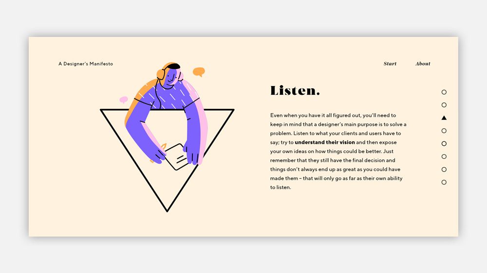
Illustration Over Stock Photography
Ditching photography for illustrations was once seen as a pretty radical move reserved for only the most eclectic of clients. After all, you wanted your client to be taken seriously, right? Not anymore! Visit large internet personalities such as Mailchimp and you’ll see infographics, illustrations, and even animated cartoons.
Why? Illustration has a few advantages over photography. One, the above mentioned “homey” factor. Loading a page to be presented by a smiling cartoon face certainly clicks the comfort button more than an all-too-perfect stock photography model. Two, say goodbye to the endless search for stock that expresses your unique message only to settle for something generic enough to not directly contradict it. And third, it’s much easier to express abstract concepts in illustration just as it is easier to draw a superhero than to conjure one in real life. I think that browsing through the 2021 internet will evoke the feeling we had turning on Saturday morning cartoons more and more.
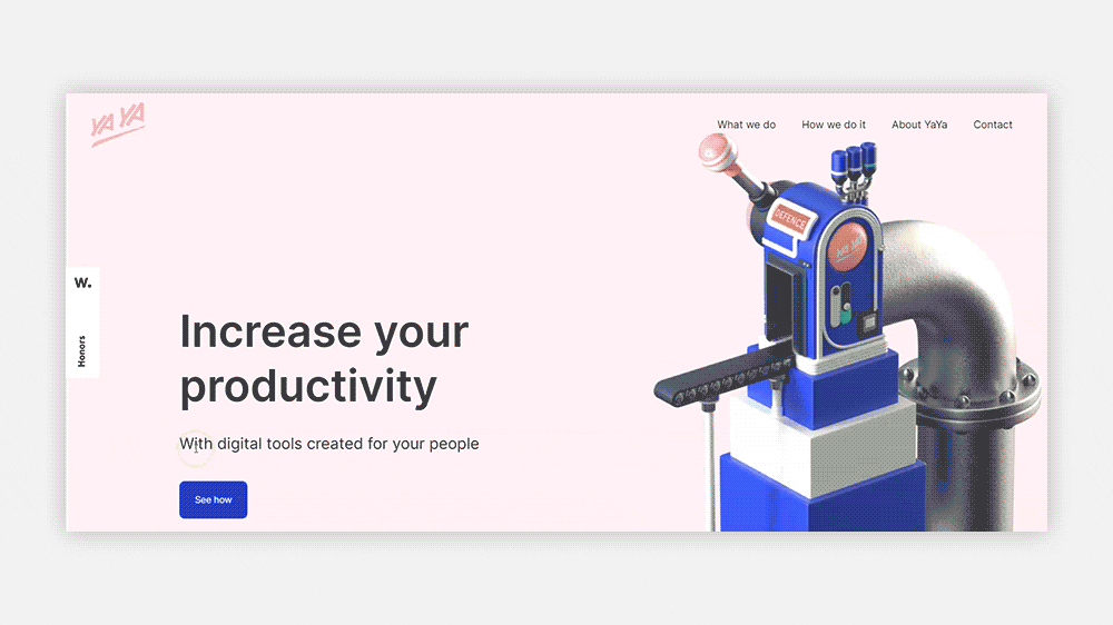
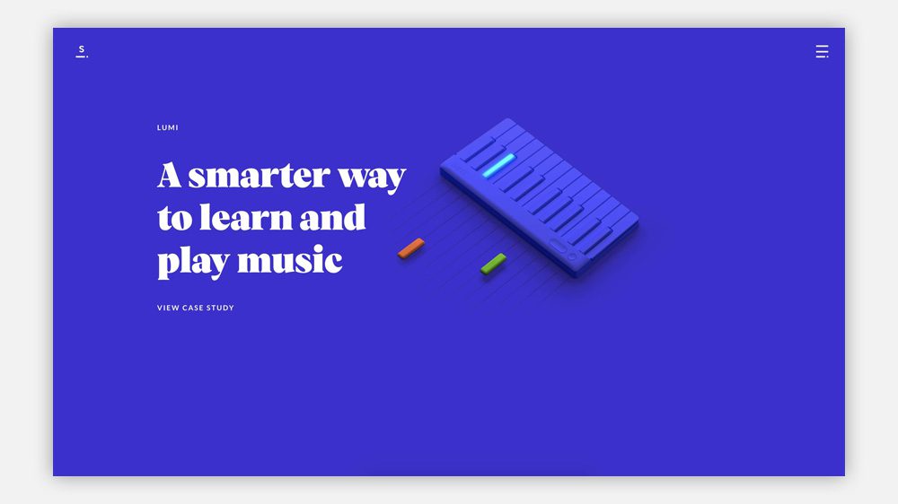
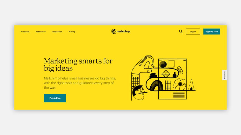
Should you use it? If you need to appear friendly and accessible and/or express abstract ideas and concepts quickly and visually, then illustration might be the way to go. Illustration does not always mean “cartoon.” It could range from high-end artistic renderings, stylized characters, or abstract shapes. Anything that gets the point across.
Here Comes The Serif
The dominance of san serif fonts for web design has a lot of roots. Was it because we were once forced to choose from a very short list of “web-safe” fonts? Was it because they rendered better on small mobile screens? Was it because they fit into the surge of minimalism that has been the vouge? In short, yes. All of those challenges have fallen away in the past few years and designers have emerged from their Roboto caves to discover the beautiful serif fonts that have been there all along.
From extremely stylish modern faces that can take a front page from Main Street to 5th Avenue to groovy slab serifs that make your landing page instantly friendly, serifs are having their time. That is not to say sans is out. Sans is still king of body copy, easy to read and does not compete with showboating serif headlines. Choose a serif to suit your site’s mood and pair it with an unassuming sans and watch your style points skyrocket!
Should you use it? Unless your branding requires you to use only sans serif fonts or your message works best in minimal buttoned-up fonts, yes! This is by far the easiest trend to hop on board and the one that will have the most “bang for your buck.”
Knock Off The Sharp Edges, Abstract Shapes and Blobs Are Safer
We’ve been used to rounded elements in our web designs, apps, and interfaces for a while. It was 6 years ago Instagram dropped their square profile pictures in favor of round ones and pretty much every social media platform followed suit. And the first iPhone launched with rounded app icons. According to Steve Jobs, “It’s very rare to find a sharp corner in the natural world […] The world is made of rounded corners. Sharp corners hurt you. Sharp corners are to be avoided.” And just like that, we are back to making the internet homey again.
Instead of experiencing a snapback from round back to square, we are seeing the evolution of our curvy web elements from perfect circles and beveled edges to something with a bit more wobble. From a colorful background of blobs to a gallery of uniquely formed bubbly icons, perfect is out.
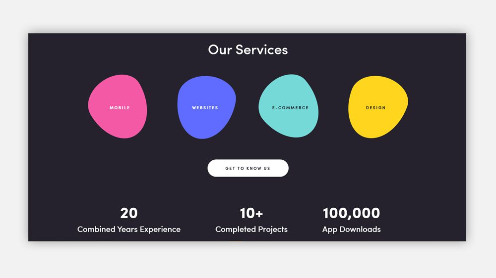
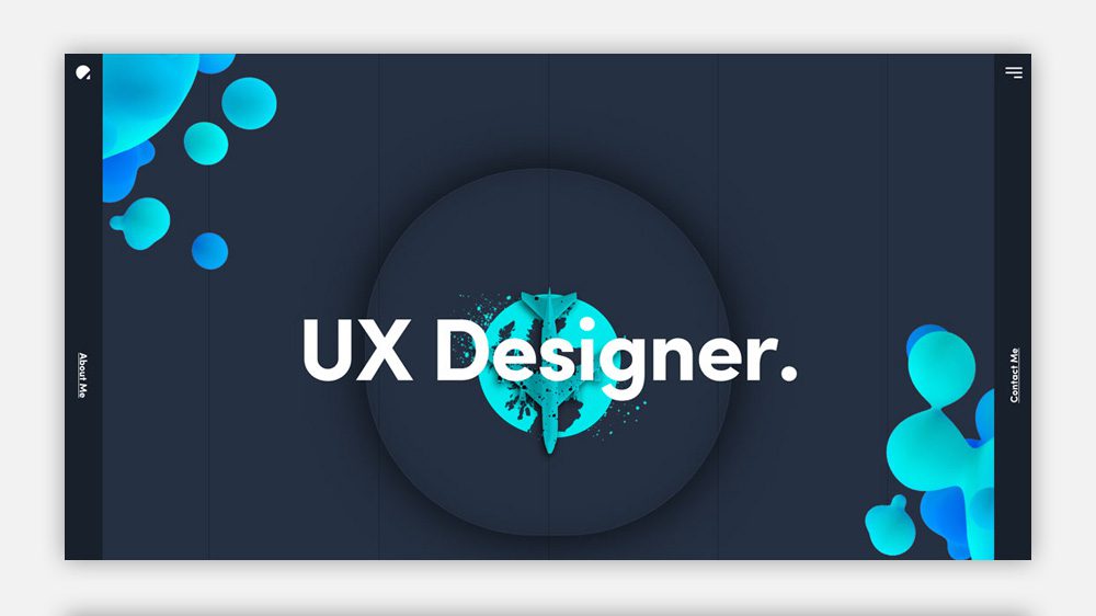
Should you use it? This trend automatically makes your presentation more casual so make sure that fits with your message and brand voice. If you need to express flexibility, creativity, and an affable nature this is for you. If you need to express perfection and stability…maybe not.
Meet Neumorphism, Skeuomorphism’s More Wordly Cousin.
If the term skeuomorphism does not send a shiver down your back you have either forgotten what your first smartphone looked like, or are young enough that you skipped this phase of user interface design altogether. In short, skeuomorphism was a design concept that stressed making a digital user interface look as much as possible like its real-world counterpart. Imagine opening up your e-reader and it looks like a fully textured wooden bookshelf filled with 3D books. Yeah, yikes.
As strange as it to look back on these early UI designs, they did serve a purpose. There was a time when not having physical media or objects for everyday tasks (like having a flashlight when the power goes out) was strange. Skeuomorphism was there to comfort a whole generation of users, teaching them new ways of doing things under the pretense that it was not different at all because it did not LOOK different. It seems like ages ago, but it was only 14 years. If this trend was a human it couldn’t even drive yet.
At some point, users got tech-savvy enough (or UI designers just realized users never did need all that hand-holding) and skeuomorphism died almost overnight with “flat design” taking its place. No more would we ignore the fact that we were constantly interacting with a brick of flat, slick glass, we’d embrace it. No more texture, no more depth. Minimal, clean, and FLAT was the order of the day.
Now it appears we are in a bit of a backlash to the flat, glass world we’ve made for ourselves. That is not to say we have swung all the way back to skeuomorphism. Instead, we reinvented it with a modern twist to make “neumorphism.”
Neumorphism took the idea of depth from older UI designs, refined it, and left virtually everything else behind. Neumorphism strives to use tricks of light (really just shadows and highlights) to make it appear that elements such as buttons are raising off our screen or receding into it while still remaining part of the screen. A bit of a gruesome but apt analogy would be Freddy Kruger’s figure pushing through Nancy’s bedroom wall in the 80’s classic.
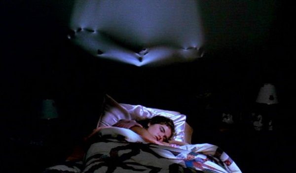
So why is it a trend now? After years of UI designers attempting to bring back dimensional designs with little success, either due to technical limitations or because they fell into the skeuomorphic valley, it seems we have stumbled on the perfect balance of flat enough to be modern but dimensional enough to draw the user’s eye. Besides who does not like a nice “clicky” button, even if it only LOOKS like it would be clicky.
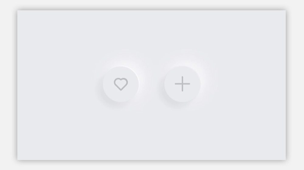
Should you use it? This is harder to recommend than other trends on this list. It is by far the trend that is most at risk of proving to be a fad, making your design look definitely “of a time and place” in short order. For now, it may be better to explore this trend on short-lived designs such as landing pages and email campaigns.
Fling Wide the Gates, Accessibility Is Important
This should not really be a trend, it should be a standard. But unfortunately, accessibility is all too often left off the list of considerations when developing digital designs. Yet, as mentioned before, we are living more and more of our lives online. An unexpected consequence of the pandemic is that it became abundantly clear that the internet needs to work for everyone when it is the only safe place you can bank, shop for necessities, go to school, or communicate with your family and friends.
The good news is that making your site more accessible is surprisingly easy and takes just a little extra thought. Some basics:
- Ensure you have enough contrast between background colors and text.
- Button text should give a clear indication of what happens when the button is clicked. “Click here” is not helpful to many people.
- Make sure to use sementic html tags such as <button> <section> <asside> <article> and <footer> to clearly define the content. This will help screen readers understand the structure of the page and what kind of conent it can expect to find therein.
- Use alt tags to describe what is happening in images.
- Make interactive elements, such as buttons, large enough to click on comfortably.
- Write in clear language.
Should you use it? Yes. It is the right thing to do, but increasingly it is also becoming the legally necessary thing to do. There has been an uptick in lawsuits centering around inaccessible websites and applications. Calls for the government to update the Americans With Disabilities Act to include more specific language about digital platforms have been growing stronger. Making your website accessible opens new opportunities for a wide range of peoples and for your business.
In Conclusion…
Many of these trends are not new. Trend lists tend to focus on fun and adventurous design choices. I think think the major change we’ve started to see over the past few years, and continuing into this year, is that larger more corporate businesses are no longer afraid to take chances on unique visuals and funky designs. It has never been easier to make websites so the challenge has shifted from trying to fit in with high-end corporate designs to setting yourself apart with personality-filled pages.
As I mentioned at the top of this post, remember, you should not ascribe to a trend to be trendy. Utilize a trend if it makes sense for your banding and if it doesn’t simply study what the underlying reasons for its popularity are so you stay on top of global user demands.
